Wings Credit Union
Inspiring new membership through ownership.
Empowering people to own their money.
Credit unions have existed since the 1800s, and yet most people still don’t understand the difference between a traditional bank and a place like Wings Credit Union.
It all comes down to one simple word: Ownership.
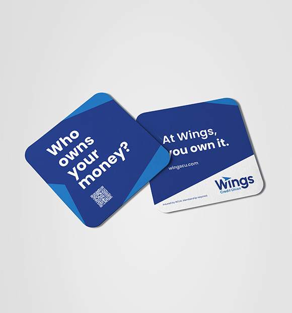
In relaunching the Wings brand, we found an opportunity to empower people early in their financial journey (18-27 year olds) to expect more out of their primary financial institution. Because at a bank, you’re a customer. At Wings, you’re an owner.

Situation
Adult Gen Z audience (among others) lacked education on the difference of Wings Credit Union over traditional banks. Namely, at a bank profits are given to shareholders. At Wings, profits are reinvested in the financial health and experience of its member-owners.
Emotional Catalyst
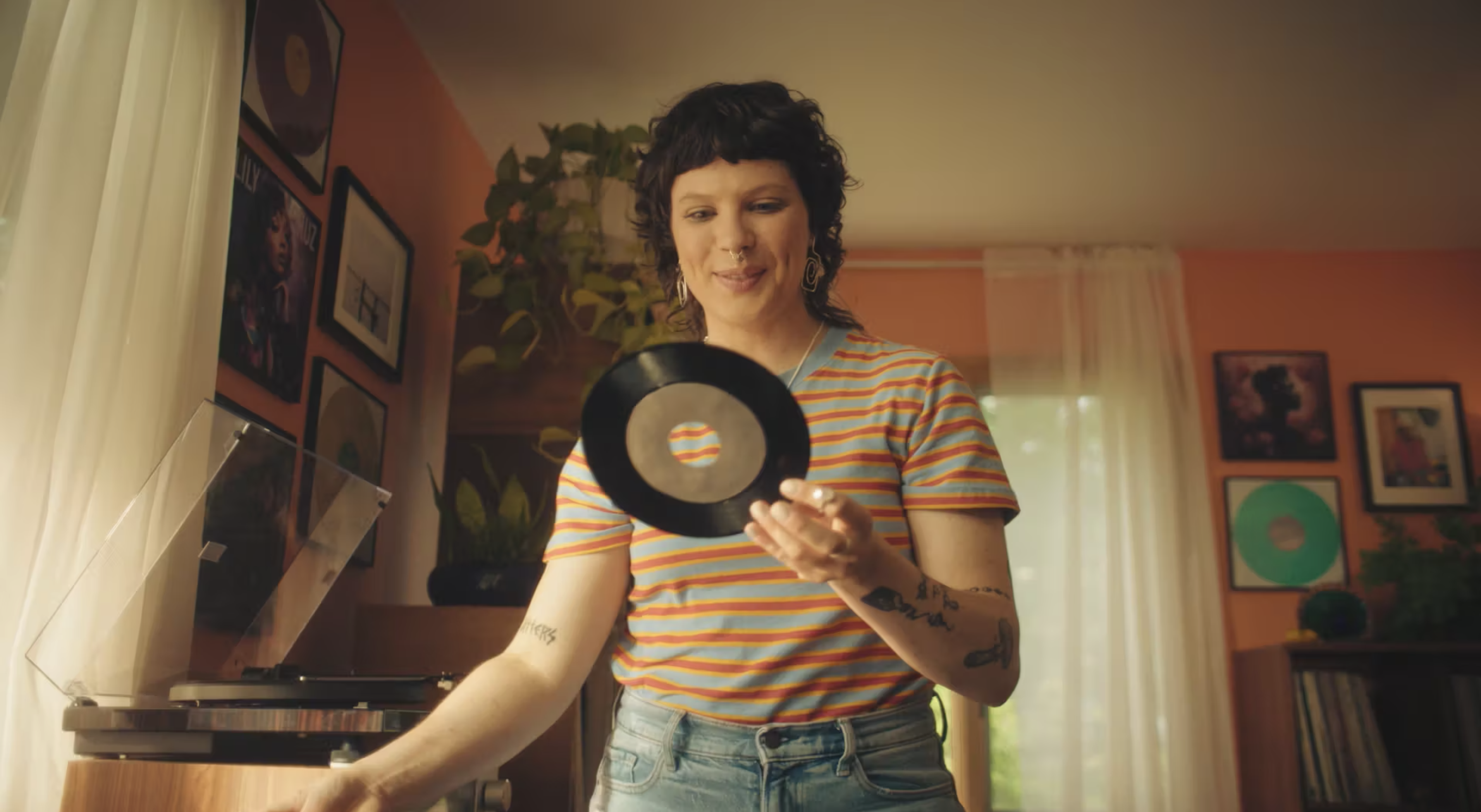
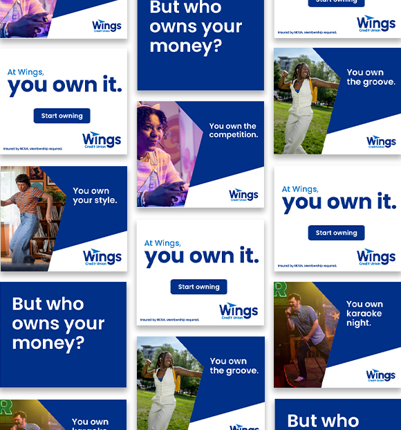
Don’t just bank your money. Own it. You own your style. You own your voice. It’s time to own your money.
Solution
The Own It campaign drew on real-life examples of empowerment and identity ownership, then challenged people to expect the same of their financial institution.
Results
Launch year saw record numbers of new membership growth, as well as total loans and savings.
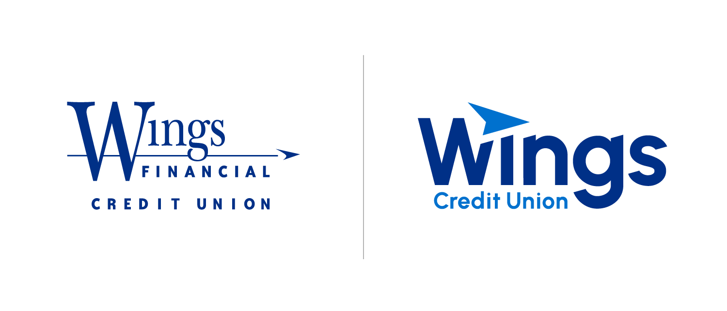
A new look for a forward thinking brand.
Along with the new brand launch, it was also time for Wings’ visual identity to better reflect the strong, bold modern financial institution that they are today. We aimed to ensure the new logo was fresh while also paying homage to familiar elements that have shaped the brand throughout the years.
