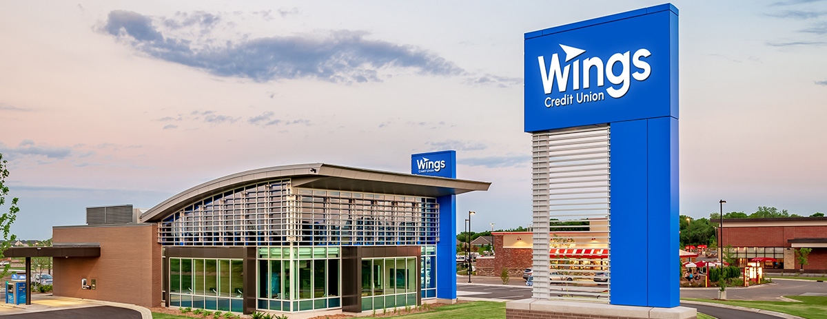
How we helped Wings Credit Union evolve
So you’ve decided your brand identity needs a refresh. Now what?
While every situation is unique, the process for modernizing a brand identity is surprisingly consistent. Let’s walk through the journey using our work with long-time client Wings Financial Credit Union as a real-world example.
The catalyst for change
Wings was undertaking a major upgrade to their mobile banking app. With their digital experience evolving, they saw the perfect opportunity to update their logo too.They were looking for something that would feel more modern, more digital-friendly, and more aligned with the future of their brand.
Asking the right questions
Brand modernization always starts with listening. Before any design work began with Wings, we met with key stakeholders to gather insights. Some of our guiding questions included:
How significant should the change be?
Are there brand elements that must remain (e.g., colors, shapes, fonts)?
What mood or feelings should the new identity evoke?
This step isn’t just about shaping a creative brief. It’s about inviting the client into the creative
process, aligning on goals and creating a shared foundation for the work ahead.
Understanding the landscape
Next, we conducted a comprehensive category audit. We reviewed logos from every financial institution that someone in Wings’ service area might consider—from big national banks to regional institutions, local credit unions, and online-only fintech players.
We found most logos fell into one of two categories:
- Outdated and overcomplicated: These logos often used small font sizes, cluttered designs, and colors ill-suited for digital use.
- Simple, modern, and bold: These identities stood out with clean typography, strong symbolism, and versatility across digital and traditional platforms.
It was immediately clear: Wings was ready to join the latter camp.
The design process
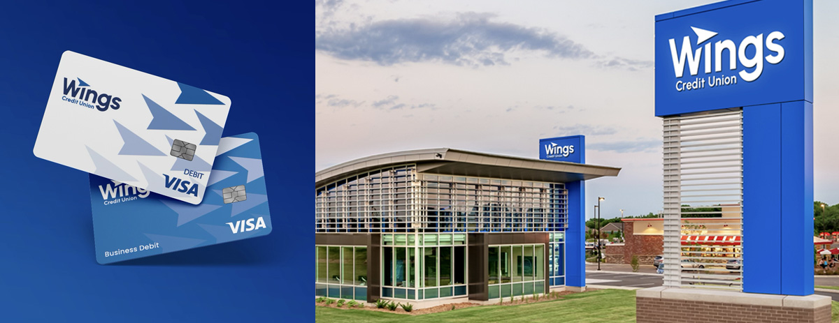
Armed with stakeholder input and competitive insights, our design team got to work. We created over 50 unique logo concepts before narrowing the field down to the strongest 7.
Then, through several collaborative working sessions with the Wings team, we refined and iterated the design concepts until we landed on the new logo—a modernized visual identity that felt fresh, confident, and unmistakably Wings.

Beyond the logo: Launching the new identity
Finalizing the logo was just the beginning. We then built a launch strategy to generate excitement among Wings’ members, employees, and the broader community. After all, a great brand identity isn’t just seen—it’s felt.

Ready for what’s next?
Modernizing a brand identity is about more than aesthetics. It’s about clarity, confidence and alignment with the future. Wings now has an identity that reflects where they’re headed—and we’re proud to have been a part of it.
Thinking about updating your own brand identity? Let’s talk.